P.R.A.D.E.

Monday, February 27, 2006

Charles Harper

In the most recent issue of Dwell, there is a profile on artist and illustrator Charles Harper. I had never seen Harper's work before, but I was instantly captivated by his colorful, 2-D, geometric wildlife drawings.

Harper became renowned for his illustrations for Ford Times magazine in the 1950's. Additionally, he has illustrated numerous biology books, including the popular The Golden Book of Biology, and his work even graced the pages of a Betty Crocker cookbook.

Equally loved for his witty and poetic captions as his unique visual style, Harper's work is what great design should aspire to be - innovative, aesthetically interesting, and grounded in substance.

You can purchase prints of Harper's work at The Frame Workshop, or pick up one of the various collections of his work in book form. Although some are out of print, a little digging at some bookstores will certainly reward you with some brilliant and unique coffee table reading material. I encourage you to head on over to this site to see (and read) more of Harper's signature, modern interpretation of our natural surroundings.

I personally love the image below, from his popular series of Serigraphs, entitled "Pelican in a Downpour." The caption accompanying the work reads . . .

If your food is all finned and your chin's double-chinned, you're a Brown Pelican, the seine with a brain. It takes some IQ to outwit a mess of menhaden or to stuff your gullet with mullet because they're always in schoool. So how come this pelican doesn't have sense enough to come in out of the rain? Well, what's a little cloudburst when you spend your life diving into the sea for sustenance. Water runs off his back so fast that take a shower a pelican't.


Image via The FrameWorkshop.

Friday, February 24, 2006

UnComfort Inn?

The second half of Daily Dose's coverage of the Hotel Puerta America in Madrid is now up. As I mentioned before when covering the hallways, it is readily apparent that "comfort" was not the primary concern of the designers in crafting the interiors of the rooms on their floors. Most of these rooms strike me as severe - and not because they eschew the traditional rules of hotel design, but because they all seem to be either so drastic in their design statements that they forgot the function of a hotel room or so simplistic that they don't represent anything new or exciting.

For example, who wants to feel disoriented inside their hotel room, as seems to be the case with Plasma Studio's experiments in triangular perspective on the 4th floor? And the blinding white of the 1st, 7th and 8th floors emit a clinical aura that would make me feel ill at ease. By contrast, the use of black in several of the other rooms seems to make the rooms unnecessarily dark. Sure that is great for sleeping, but who would want to hang out in a cave of a hotel room? Isn't it possible to be innovative without resorting to extreme contrast? Can't a designer use some color in a hotel room? (without using ALL of them like Victorio and Lucchino's 5th floor).

And maybe I am being nitpicky, but there are also several floors that appear overly simplistic to me, failing to be interesting or comfortable. For example, check out the 2nd, the 3rd and the 6th floors. All of them use black and white contrast. The 2nd and 6th are both the same sleek aesthetic that you see thousands of times and never appeals to me, and the 3rd looks like a converted shower room.

Of course that's all just my opinion. My favorite room was probably Isozaki's modern take on traditional Japanese style (pictured below). I liked the use of the different textures, particularly his interpretation of the paper screen covering the window. Although the overall room seemed dark to me (there is a bright red cabinet, not pictured), it seemed to make a nice balance between making a statement and still offering a warm, comfortable room.

The same might also be said for Gluckman's room, although I keep thinking the room would be plagued by a low buzz from the fancy lights.


You can see even more pictures of each and every floor at this site. Of course, nothing compares to actually staying in the room for yourself, so if anyone is passing through Madrid soon, check out a room and let me know what you think.


Via Daily Dose


Via elmundo.es


Via elmundo.es

Friday, February 17, 2006

What Would Dan Flavin Do?


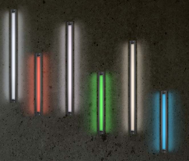
In conjunction with a Dan Flavin exhibition in London called Dedications, The Hayward Gallery has created a microsite that allows you to create your own Flavin light installation.

View PRADE's effort here (also pictured above), and go create one of your own. Maybe your own fluorescent light bulbs will be hanging on the wall of an art gallery one day.

Via Cool Hunting.

Halls of Fame

If you read design magazines or sites, you've likely heard of the Hotel Puerta America in Madrid. The concept of the new hotel was to have a different famous architect design each of the 12 floors, plus the lobby and roof deck. The chosen architects designed everything from the hallways to the rooms. I've seen some photos of the various floors, but hats off to Daily Dose for providing us with a complete rundown of the hallways of each floor, top to bottom.

Almost all of the hallways appear to be design statements more than attempts at aesthetically pleasing decor. While they represent a departure from traditional hotel hallways, they all make for dramatic surroundings that will surely make guests feel like they are in some form of sci-fi movie rather than a pricey hotel.


My favorite ones are below, but go on over to Daily Dose and check out all the various floors.

Victorio and Lucchino's 5th floor, Mariscal and Salas's animal print 11th floor, and Richard Gluckman's stoic 9th floor are the only ones that approach resembling traditional hotel hallways to me.

I really liked the bright white light of Ron Arad's 7th floor and its metallic, handwritten room numbers. However, I imagine I'd have a headache after 3 minutes of walking down the hallway. Which would likely also be the case for the shiny red of the 6th floor, the blue glow of the 8th floor, the reflective polygons of the 4th floor, and the white, womb-like walls of the 1st floor.

By contrast, I think you would need a flashlight to help find your rooms on 12th and 10th floor, as the hallways are bathed in black with minimal lighting (although those hallways would be a little more hangover friendly).


In fact, overall I would say most of the architects weren't too concerned with the comfort of the guests, which is even more evident when you see the designs for the guest rooms themselves. Warm is not a descriptive term that comes to mind. I'll let you know when Daily Dose does its future feature on the interior of the rooms, and we can discuss.


David Chipperfield's third floor would normally be too industrial for my tastes, but it is almost conservative in comparison to the other floors. Its sci-fi chic atmosphere is further enhanced by the high-contrast lighting scheme.


Norman Foster's second floor is similar to Arad's, but the black carpet helps mute the design slightly, and the glass walls add an interesting, almost clinical feel to the surroundings that again brings in the futuristic, dystopian element. I picture a soothing woman's voice coming over the intercom reminding the guests to "be well."


Tuesday, February 14, 2006

Kentucky Skyscraper

The Office of Metropolitan Architecture's design for the Museum Plaza in Louisville, KY.


Never have I witnessed more attention being paid to a building going up in Kentucky.

See what all the fuss is about
here, here, and here.

Life Without Buildings makes the astute observation that the design for the Museum Plaza is eerily reminiscent of a previous OMA design, while Tropolism raises the question of whether the building can overcome the inherent problems of the elevated plaza model on which the building is based. And Daily Dose recommends checking out the music video.

The design is definitely an interesting re-imagination of the classic skyscraper - with much of the building's form stemming from OMA's vision for its various functions. The result is a jumble of overlapping rectangular forms that look remarkably futuristic in their radical departure from the traditional skyscraper. Maybe it is the platform like appearance of the 61 story structure that gives it its sci-fi, dystopian aura. I also agree with Tropolism that locating the main plaza 20+ stories off the ground is going to limit the amount of foot traffic the building might have otherwise garnered.


The $305 million project is scheduled to break ground in 2007.

Cuddly Photo of the Week

While the entire North East was being buried under a foot-deep, frosty blanket, the National Zoo's panda cub, Tai Shan, was enjoying his first taste of the snow.


Via the Washington Post.

Nothing design related, but sometimes we all need to stop and look at the Pandas.

Friday, February 10, 2006

Hidden City


Speaking of
contests, here is another one from the folks at Tropolism.

The
Your Hidden City contest is looking for the best photos of the city through your eyes.

"It may be in plain sight of everyone else, but it is your eye that finds the extraordinariness in a particular street corner, a unique stair, a crazy intersection, a visually arresting approach, or a particular tree in the city . . . The entries should have one thing in common: they demonstrate, to you, the pleasure of living in the city."


You can submit the photos to Tropolism's
Flickr site or email them. All photos must be accompanied by a caption explaining what the image means to you. There are five categories that the panel of blogger judges will select:

Best Hidden Place

Best Density

Best Natural/Urban Overlap

Best Unofficial Landmark

Best Building


The contest is open until March 10th. So go out and explore your cities with cameras in hand.


Weekly Drop

I consider myself somewhat of an early adopter when it comes to technology and cultural trends. However, I have yet to hop on the podcast bandwagon. Until now.

I just listened to an episode of WeeklyDrop - a weekly podcast that gives listeners an inside peek at the sneaker collecting game. The hosts are true kicksologists - so keep a fresh window open to Google some of the stuff they are talking about. However, dedicated sneaker collectors and amateur enthusiast alike should all enjoy the sneaker-geek humor and exclusive info featured in each podcast. The guests are top notch names in the sneaker world, and topics cover the full spectrum from exclusive colorways and rare releases to debates about the most comfortable pairs or how to rock your laces.


Episode 6 features an interview with Retrokid about the story behind these creations.

Check out past episodes right here and sign up for updates on when the new hotness hits the podwaves.

Via Cool Hunting.


Wednesday, February 08, 2006

The Desert Lab

Many of you may be familiar with "Sambo" Mockbee's Rural Studio, an offshoot of Auburn University's architecture program that allows students to learn through the process of actually designing and constructing low income homes in rural Alabama.

Well, a similar design/build laboratory framework has been established by Mary Hardin at the University of Arizona in Tucson. Her and her students are exploring alternative construction methods (rammed earth, paper bale, straw bale) in order to develop affordable housing options for local communities.

The program grew out of an initial project to construct a new classroom facility for the University's Athletics and Recreation Department. Since that time, students have already built multiple structures with methods they developed and tested themselves, including the Habitat for Humanity Straw Bale House pictured below.


Habitat for Humanity Straw Bale Residence (model and interior).

Prof. Hardin has also used the rammed earth techniques explored in the program to design a project with the Dean of the College of Architecture, Richard Eribes. The result is a striking and energy efficient design that blends perfectly with its desert surroundings.


The Elser House was constructed using rammed earth techniques.

The design/build method employed by both Auburn and the University of Arizona present exciting possibilities for moving architecture schools away from merely theoretical exercises and toward more practical experiences and applications. The socially responsible focus of both these programs is also refreshing, as the emphasis on bringing good design to affordable housing is long overdue

Via Land+Living.

Calling All Responsible Treehuggers

Treehugger is hosting a "Waste of Packaging" contest. The rules are simple - take a picture of anything that you believe is overpackaged and unnecessarily environmentally cruel. Then explain what you would do to make the packing more eco-kind. Winner receives a $250 gift certificate to re:modern.

Email the picture, description, and solution to: contest [at] treehugger [dot] com. The deadline is February 20th, so keep your eyes peeled for particularly preposterous packaging.


Tuesday, February 07, 2006

Blinded By The Light

BLDGBLOG's Geoff Manaugh has written a thought provoking piece for Inhabitat about light pollution.

Light pollution seems a particularly interesting topic to me because it is one example of the impact of modern living on the environment that is completely reversible with just the flick of a switch. San Francisco appears to be a relatively low light polluting city, as the starry sky is readily visible from the park right outside my front door. However, I remember DC being a particularly bright city and was always struck by how few stars were visible, even from the rooftops of DC buildings.


The article touches on several effects of man-made illumination, and some efforts by concerned star watchers to stem the "light trespass" of cities and towns. I found this passage particularly interesting:

"The blazing horror of unnecessary self-illumination practiced by gas stations, shopping malls, casinos, cinemas, etc., has been shown to interfere with the bio-rhythmic cycles of local and migratory species (humans included). For instance, in areas aglow with light pollution, "birds [chirp] throughout the night, in anticipation of a dawn that will not arrive." Dung beetles wander in circles. Glowworms lose their ability to mate. Grown men watch television for hours at a time."

Who would have known that flood lighting could destroy the sex life of glowworms?

It is always interesting to think of the unintended and unforeseen impact we have on our surroundings, and light proves to be a particularly compelling example. Its impact becomes almost ironically invisible to us because it dissolves into a sort of visual background noise of living. Geoff gives some great examples of artists who are trying to make that impact visible again in order to raise some of these very issues.

Head on over and read the article, and then maybe you will see your neighborhood surroundings in a new light.

Monday, February 06, 2006

PRADE Tales from the Road: Groom Cross

I want to say a big welcome to the readers coming over to PRADE from your favorite architecture blog and mine, A Daily Dose.

As most of you newcomers probably don't know, PRADE recently relocated to San Fran from Washington DC. But PRADE didn't just hop on a plane or rent a Uhaul - PRADE went cross country
in style. I've only posted a few things from the trip so far, so I'm starting a new feature called Tales from the Road - little tidbits about my experience Cadillac-ing my way across the US of A.


First up - the largest cross in the Western Hemisphere. Any guesses where it is located? That's right, Texas - God's chosen state.


If you look close, you can see ant-size cars at the base of the cross.
Compensating for a lack of faith?


Situated only a shotgun blast's distance off of I-40 in Groom, Texas, just a few hundred yards past the
Leaning Water Tower (I shit you not, that really counts as an attraction in Texas), the 190 foot high cross is visible from miles around. I didn't stop at the cross, but that appears to be my loss, as the base of the cross features a veritable theme park of Jesus attractions.

If you are ever driving on I-40 through Texas (and hopefully you have a destination that doesn't lie within Texas) I definitely recommend sticking your camera out the window and taking a picture of the humongous white cross as you zoom by as fast as possible. You can't miss it - it is the huge f*&%ing cross surrounded by hundreds of miles of flat nothingness.

PRADE's Valentine's Day Advice: Dinner With A View

In honor of next week's overcommercialized yet mandatory occasion for spoiling your loved one, PRADE offers a foolproof plan for impressing your special someone. Take them for a drive along the coast of California to a memorable spot tucked away in the heart of Big Sur called Nepenthe.

Perched on a hilltop in Big Sur, high above the crashing surf of the Pacific ocean is Nepenthe, a restaurant that is as breathtaking as it is romantic, and as historically compelling as it is warm and inviting.


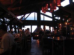
Interior of Nepenthe (image via JRabold.net)

Nepenthe has been serving delicious dinner with a view for over 50 years. The property was purchased in 1947 from Hollywood legends Orson Welles and Rita Hayworth, who originally bought the property as a romantic getaway but never spent a single night there. The vision of the new owners, Bill and Lolly Fassett, was to transform the site into a unique, open air venue for dining and dancing under the stars. Taking cues from Frank Lloyd Wright's popular style, the pavilion-shaped restaurant was erected from local redwoods and handmade adobe bricks. However, the most important feature of the building was not what lay within the walls, but what surrounded Nepenthe from without . . . a sweeping panoramic view of the Pacific coast surrounded by Big Sur's towering forests and crisp sea air.

And Nepenthe knows how to make the most of the views, with the majority of the dining space located on wooden decks that skirt the exterior of the building and face the never-ending blue of the Pacific ocean. It also features a large, outdoor fire pit surrounded by comfortable cushions from which to soak up the expansive night sky.


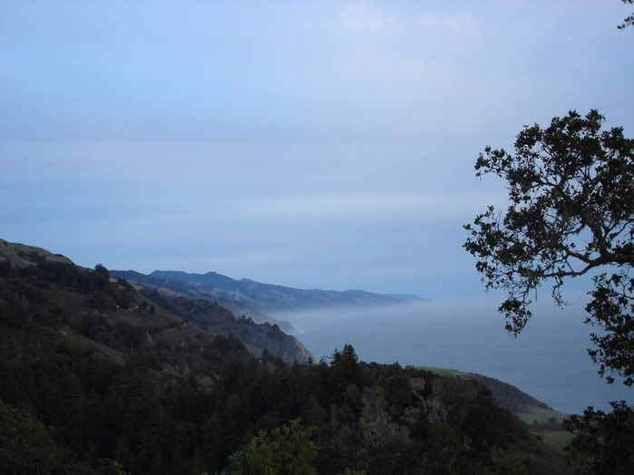
View from the exterior deck.

The restaurant has attracted a variety of visitors, from writers and artists to Hollywood types. Elizabeth Taylor and Richard Burton danced on the open air stone patio in their 1963 film The Sandpiper, and writer Henry Miller was known to take a ping pong lashing from owner Bill Fassett. But in the case of Nepenthe, it isn't the big names or the storied history that are the draw, it is the instant atmosphere created by watching a Californian sunset while perched high among the trees, with the sound of the waves below and a cozy fire to keep you warm.


Filming The Sandpiper in 1963.

Nepenthe is located along Highway 1, a half hour drive south of Monterey. You can check out the view from the deck at all times with Nepethe's webcam, and find dining information on their site.

PRADE's Valentine's Advice: If dinner at Nepenthe doesn't impress your loved one . . . nothing will. Dump 'em and move on.